My Perfect Calendar App
It’s been a while since Marco Arment posted about the failing of digital calendars to pull away from the familiar formats of physical calendars. When I read it back then, I found my head nodding the whole time in agreement. There are lots of limitations that your typical calendars and planners have, since they are tied to physical constraints. So, it’s somewhat surprising that in four years since that post, no one has built an iPhone calendar app that addresses these shortcomings. At least that I’ve been able to find.
A summary of his points:
- I don’t care about the past. It can be hidden in a separate view for the rare occasions that I want to look at past items. Yet the past is consuming the majority of the interface.
- I don’t care about present-and-future items with equal granularity. I wouldn’t mind seeing today in an hour-by-hour view, but I don’t need the same granularity when showing events three days from now.
- If I switch to a more granular view for today, I lose the ability to see any of what’s happening next week.
First, I must repeat Marco’s point: Don’t show me the past. Don’t even let me go to the past. I’m living in the now, people! Forward and onward. I don’t use my calendar to reminisce. Quite a few calendar apps get this wrong, and it’s frustrating. This is the first thing I check whenever I try a new app. If it treats the past the same as the future, it’s an immediate turn off. When a calendar app let’s me scroll willy-nilly from this week to last week and last month, I feel disoriented. It fails to acknowledge the basic fact that people don’t care about the past when using a calendar app. On the other hand, when an app prevents me from going to yesterday, or at least adds some friction, it makes me smile. It feels good to be anchored to right now, because that’s where—and when—I am.
Marco’s next point is that “I don’t care about present-and-future items with equal granularity.” He goes on to talk about wanting to see hour-by-hour detail without losing the ability to see what’s happening in the coming week. The general idea here is that not all the hours on my calendar are equally important to me. I completely agree with Marco’s point and suggestion and would love to see an app that does what he proposes. But let me expand on this concept on a different dimension.
Even when I’m looking at my current day, there are times in my day that I don’t care what’s going on. At least, not in the same way. One such time, for example, is while I’m sleeping. The point is, any open slots on my calendar should be treated differently. My appointments have names, places, notes, and other information that I want to see. By definition, the free time on my calendar does not. Most apps handle this by providing a list view where you only see your scheduled items. By limiting the presented information to scheduled events, you get the most information density. This is a passable, but a huge compromise. I don’t care about my open slots in the same way, but I want to see some acknowledgement that they exist.
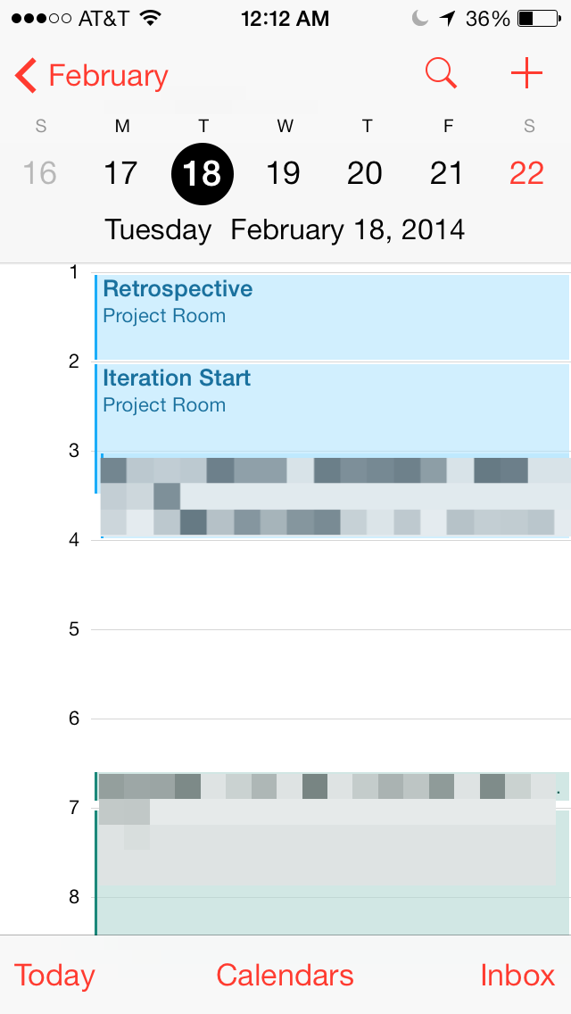
The problem with a list view is that it’s incongruous with the reality of the continuity of time. I don’t teleport from meeting to meeting in a discrete way. But that’s what’s subtly implied by such a list. Hey, I’m in the conference room. Now I’m taking out the trash at home. There’s no sense of the time period between these events. There’s also no visual sense of the durations of the events. A fifteen minute standup looks the same as a two hour planning meeting when displayed as a list item. However, if you do display events to scale (as in a detailed day view), you’re back to treating time as equally important, which is where this rant began.
Another problem of displaying at the hourly granularity is that it’s impossible (on a phone screen) to fit more than about twelve hours without sacrificing readability and usability. I’d like to see the next twenty-four hours, but there’s physically not enough room. That’s another motivation to handle areas of a calendar differently.

What I’m looking for is something in between the list view and a day view. Show me the next twenty-four hours (Or what should this value be?) worth of events on one screen, but don’t ignore my free time. Give me a sense of the landscape of my schedule. Is my day fragmented by meetings? Where are the large chunks of time I have? Am I free tonight?
There are plenty of apps that provide an overview. There are lots of apps that provide a detailed daily view. But I still haven’t found one that does both at the same time. It’s a hard problem. It’s much easier to break up the information into different views: Day, Week, Month. It’s how calendars have been rendered for a long time. But there’s (still) a great opportunity with digital to improve this.
Saturday, February 22, 2014